Microsoft Power BI for Technical Services and Collection Development Reporting
Reporting is an essential function in libraries, particularly in the areas of acquisitions, accounting, cataloging, and collection development. In my time as an acquisitions and collections librarian, I’ve used tools like Microsoft Excel, OpenRefine, and Tableau products to manipulate and visualize data, often as part of the same pipeline. However, this patchwork of multiple tools can become overly complex and difficult to replicate in recurring collection development workflows.
Over the past year and a half, I’ve trained myself to use Microsoft Power BI as my primary tool for reporting activities. Power BI offers the functionalities necessary to import, clean, manipulate, combine, visualize, and publish data. While I haven’t yet crafted any continual end-to-end workflows, I’ve successfully used Power BI in projects such as bibliometric analysis, serials renewals, and a large-scale withdrawal project, which I will describe below. In his TCB review of the software (2022), Philip Evans provides a good introduction to Power BI. I hope to expand on that introduction by describing some cases in which I’ve used it.
About Microsoft Power BI
Power BI is a comprehensive tool that can connect to data stored locally or in the cloud. It provides functionalities similar to those of Excel, Microsoft Access, and OpenRefine for cleaning and combining data, creating data visuals, and assembling and delivering dashboards with access permissions and embedding options. It also allows monitoring of dashboard usage.
My learning curve for Power BI was manageable, leveraging my familiarity with Excel, experience with Web-based SharePoint, and some experience with Microsoft Power Automate. By referring to resources from our library’s O’Reilly for Higher Education database, I was able to take multiple years of Scopus data for our system campuses and combine them with data from sources like Unpaywall to create reports for our executive committee.
In the past, I’ve used a combination of Excel, OpenRefine, and Tableau Public to work with data. However, when faced with a high-priority project requiring the full version of Tableau, which is available by monthly subscription, I explored other options and found that Power BI is included in our Microsoft Enterprise account.
Cases
Scopus bibliometric data
For this project, the consortium collection development group I am part of needed a better understanding of our university system’s open access article output as we prepared for license negotiations. I harvested several years of affiliated author publications from the Scopus database and used Power BI to clean the data, combine it with Unpaywall data, and create visualizations for our negotiation committee. For the committee, I created one dashboard that allows members to download the full source data. For librarians not on the committee but who might have an interest in the data, I created a second dashboard with view-only permissions.
Using data from Scopus and Unpaywall, I created a Bibliographic Analysis visual (Image 1) of articles written by University of Nebraska-affiliated authors in the calendar year 2021 and published by the top five open access publishers: Elsevier, Taylor & Francis, Springer, Sage, and Wiley. The “All Publishers” pie chart includes all articles available in the data set and is not limited to the top five publishers.
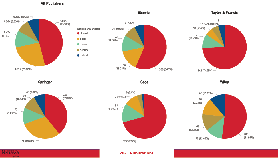
Image 1: Bibliographic Analysis. Extended description of Image 1.
EBSCO renewals
Technical services librarians often evaluate and submit renewals for individual journal subscriptions. In this project, I experimented with combining Microsoft tools from our Enterprise account to create a way of requesting liaisons to review and interact with our renewals visually and then submit requests for cancellations, format changes, or more information to a list that all requesters could see.
We use EBSCO as our subscription vendor, so I combined several reports from EBSCONET to create visuals that allow librarians to review by material type, alternative formats available, cost, and publisher. I intended to include usage data but could not due to time constraints.
The EBSCO Renewals visual (Image 2) is an example of a report formatted according to publisher and Library of Congress Classification to view the renewals. The “Submit a Change” and “Submit a Question” buttons were live in the dashboard and took the librarian to the appropriate form in Microsoft Forms for submission. Upon submission, the request was populated into a list for all to see, and I received an email alert. I used Power Automate to set up the list population and email alert.
While I think I succeeded in building a functional, interactive dashboard, it was not used by any librarians but me. I think this had to do with time constraints and training needs.
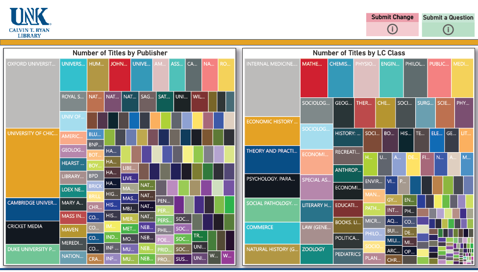
Image 2: EBSCO Renewals. Extended description of Image 2.
Stacks withdrawal
For this project, our systems specialist Matt McDowall and I collaborated on an automated data pipeline to provide real-time reporting on a rapid withdrawal. Daily withdrawal reports were generated in Alma Analytics and then emailed to Outlook. McDowall created a Python script to unzip the file and deposit it into SharePoint, overwriting any existing file. I created a Power BI dashboard with a time-lapse visualization and set the dashboard to refresh the data daily. Finally, the dashboard was shared with all library staff, as everyone was involved in the withdrawal project.
The Withdrawal Report visuals are snapshots of this dashboard, which users can “play” to show the daily progression of the project. In the first visual (Image 3), each box represents the total number of books withdrawn from a Library of Congress (LC) class. As the time lapse is played, a proportion of the box is shaded to indicate the number of books withdrawn from that class on a particular day. This allowed us to see from which areas of the collection we were withdrawing according to LC class as the project progressed.
In the subsequent three visuals, the Running Daily Average shows the average number of books withdrawn daily for the whole project from the stacks (Image 4), government documents (Image 5), and both combined (Image 6). As the time lapse played, the black box shaded, allowing us to see how many books we withdrew on a given day and how that compared to our average. The Running Total column slowly filled up as the time lapse played.
Again, we felt we succeeded in building a functional dashboard, but it was not referred to by many in the library except me and McDowall.
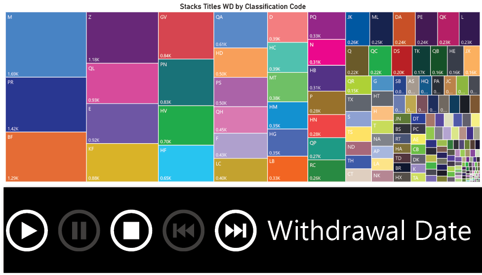
Image 3: Withdrawal Report by LC Class. Extended description of Image 3.
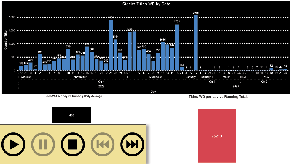
Image 4: Stacks Titles Withdrawn by Date. Extended description of Image 4.
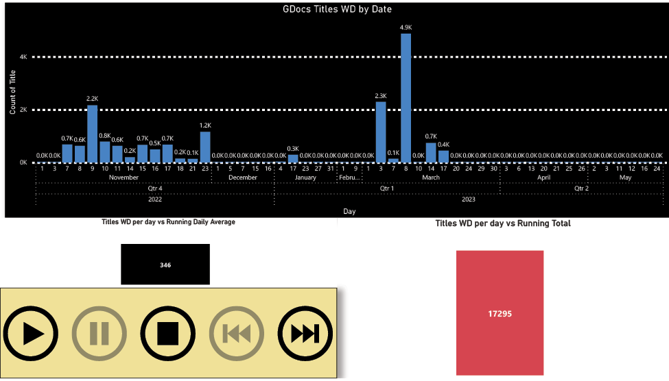
Image 5: Government Document Titles Withdrawn by Date. Extended description of Image 5.
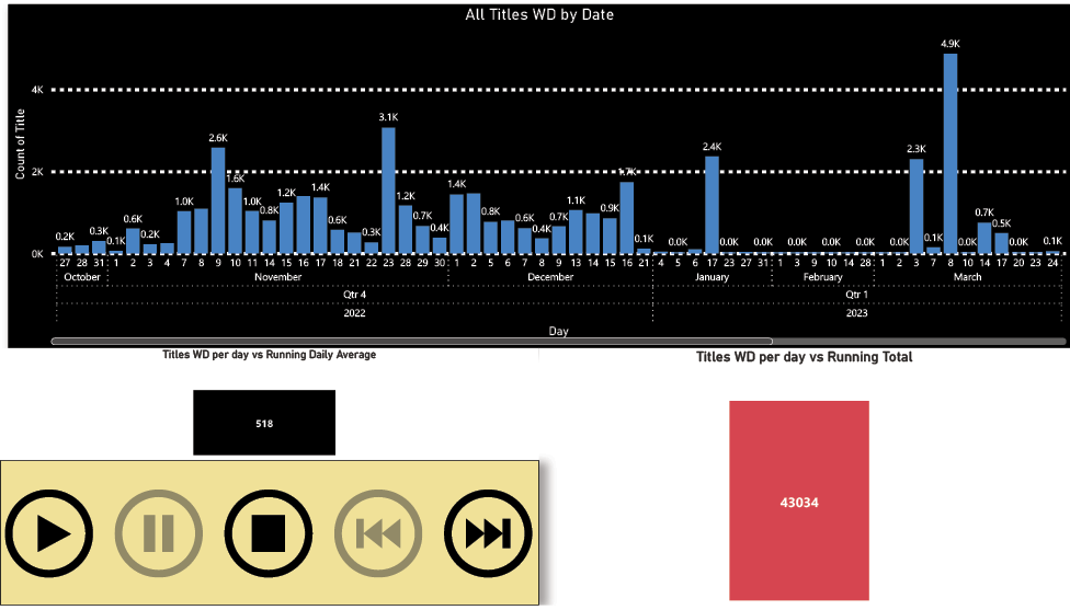
Image 6: All Titles Withdrawn by Date. Extended description of Image 6.
Keep in Mind…
Data discrepancies
In the stacks withdrawal project detailed above, I noticed a discrepancy in the data between the Power BI Desktop application and the cloud-based Power BI service (Web delivery). After some investigating, I found that it appears this is a known but unresolved issue that can happen and may be due to differences in how each platform parses the data.
Data visuals
While Power BI can create familiar data visuals, such as bar graphs and pie charts, other data visuals are available, like the time lapse I used in our withdrawal dashboard. There are many options for color and data labels you can apply to your visuals. However, if you take the time to set this up in Power BI Desktop, the color settings don’t generally carry over to the Power BI service, so you would need to set them again.
It takes a team
While librarians who are comfortable with Microsoft products and tabular data should find the transition to working with data in Power BI mostly painless, some may need to collaborate with others to use the fuller functionality of visualizing and delivering data. In the future, I plan to involve several librarians in Power BI projects, including our new Web Services Librarian, who has expertise in user engagement.
Conclusion
Power BI is a great option for technical services librarians looking to analyze and visualize data in more ways than those offered by Excel, OpenRefine, or Tableau Public. A feature I’m looking forward to exploring is the ability to run R and Python scripts in the Power BI environment. Though Power BI is quite comprehensive for data cleaning, analysis, visualization, and delivery, like all tools it requires an attentive eye. It’s also important to encourage usage by promoting your dashboards.
Additional Resources
At the NASIG Conference in 2023, librarians from Minnesota State University, Mankato, shared their experience using Power BI to visualize data for campus outreach. Their presentation is available through their digital repository (Gustafson-Sundell et al. 2023).
I found Chris Sorensen’s “Introduction to Microsoft Power BI” video series (2021) helpful as I began working with data in Power BI.
References
Evans, Philip. 2022. “Review of Power BI in Technical Services.” TCB: Technical Services in Religion & Theology 30 (1): 10–10. https://doi.org/10.31046/tcb.v30i1.3037.
Gustafson-Sundell, Nat, Evan Rusch, Pat Lienemann, and Jeff Rosamond. 2023. “The Collections PBI: Interactive Data Visualization for Campus Outreach.” Library Services Publications, May 2023. https://cornerstone.lib.mnsu.edu/lib_services_fac_pubs/205.
Sorensen, Chris. “Introduction to Microsoft Power BI (Video).” 2021. Microsoft Press. https://learning.oreilly.com/videos/introduction-to-microsoft/9780137456314/.
Extended Image Descriptions
“Image 1: Bibliographic Analysis. ” on page 2
The bottom of the image includes a red bar labeled “University of Nebraska System” in black text corresponding to university branding conventions. A white gap in the middle of the red bar includes the label “2021 Publications” in red text. The remainder of the image contains six pie charts. Each pie chart shows five colored pie slices illustrating the percentage of articles corresponding to each open access status. Closed status displays in red, gold status displays in orange, green status displays in green, bronze status displays in gold, and hybrid status displays in dark blue. Each pie slice is labeled with the number and percentage of articles represented. The largest category begins at the top middle, with the remaining categories shown in decreasing size when viewing the pie chart in a clockwise motion.
The pie chart in the upper left corner is labeled “All Publishers.” It shows that 1.88 thousand articles are closed status and constitute 45.94 percent of the whole. 1.05 thousand articles are gold status and constitute 25.62 percent of the whole. 0.47 thousand articles are green status and constitute 11.5 percent of the whole. 0.36 thousand articles are bronze status and constitute 8.83 percent of the whole. 0.33 thousand articles are hybrid status and constitute 8.05% of the whole.
The pie chart in the upper middle is labeled “Elsevier.” It shows that 588 articles are closed status and constitute 56.7 percent of the whole. 156 articles are gold status and constitute 15.04 percent of the whole. 123 articles are green status and constitute 11.86 percent of the whole. 94 articles are bronze status and constitute 9.06 percent of the whole. 76 articles are hybrid status and constitute 7.33 percent of the whole.
The pie chart in the upper right corner is labeled “Taylor & Francis.” It shows that 242 articles are closed status and constitute 74.23 percent of the whole. 34 articles are green status and constitute 10.43 percent of the whole. 18 articles are gold status and constitute 5.52 percent of the whole. 17 articles are bronze status and constitute 5.21 percent of the whole. 15 articles are hybrid status and constitute 4.6 percent of the whole.
The pie chart in the lower left corner is labeled “Springer.” It shows that 229 articles are closed status and constitute 39.08 percent of the whole. 178 articles are gold status and constitute 30.38 percent of the whole. 70 articles are green status and constitute 11.95 percent of the whole. 60 articles are bronze status and constitute 10.24 percent of the whole. 49 articles are hybrid status and constitute 8.36 percent of the whole.
The pie chart in the lower middle is labeled “Sage.” It shows that 157 articles are closed status and constitute 70.72 percent of the whole. 31 articles are green status and constitute 13.96 percent of the whole. 22 articles are gold status and constitute 9.91 percent of the whole. 8 articles are bronze status and constitute 3.6 percent of the whole. The pie chart includes a small slice representing hybrid articles, but the slice is not labeled.
The pie chart in the lower right corner is labeled “Wiley.” It shows that 280 articles are closed status and constitute 51.95 percent of the whole. 67 articles are green status and constitute 12.43 percent of the whole. 66 articles are gold status and constitute 12.24 percent of the whole. 60 articles are hybrid status and constitute 11.13 percent of the whole.
“Image 2: EBSCO Renewals” on page 3
The upper left corner of the image is labeled “UNK Calvin T. Ryan Library” in dark blue, corresponding to library branding conventions. The upper right corner of the image shows two rectangular buttons side by side. The button on the left is pink and is labeled “Submit Change” in a darker pink bar at the top. The button on the right is green and is labeled “Submit a Question” in a lighter green bar at the top. Underneath the buttons are two treemaps side by side. Each treemap is made of nested rectangles that begin with the largest size and grow gradually smaller to indicate the relationship of each part to the whole. The treemap on the left is labeled “Number of Titles by Publisher” in black text at the white margin at the top of the chart. Each rectangle is labeled with a different publisher’s name, but each rectangle is too small to display the entire name. The treemap on the right is labeled “Number of Titles by LC Class” in black text at the white margin at the top of the chart. Each rectangle is labeled with the name of a subject that corresponds to a class in the Library of Congress Classification system, but each rectangle is too small to display the entire name.
“Image 3: Withdrawal Report by LC Class. ” on page 4
The white margin at the top of the image is labeled “Stacks Titles WD by Classification Code” in black text. Underneath the label is a treemap made of nested rectangles that begin with the largest size and grow gradually smaller to indicate the relationship of each part to the whole. At the top left corner of each rectangle is a label with one or two letters that correspond to classes and subclasses of the Library of Congress Classification system. At the bottom left corner of each rectangle is a decimal number followed by the letter K, indicating how many thousands of items were withdrawn from the section of the stacks corresponding to the Library of Congress Classification class or subclass.
Underneath the treemap is a large black bar running across the width of the page. On the left side of the bar are five round white buttons marked with symbols indicating “Play,” “Pause,” “Stop,” “Go to the beginning,” and “Go to the end.” The right side of the black bar is labeled “Withdrawal Date.”
“Image 4: Stacks Titles Withdrawn by Date. ” on page 4
The top half of the image is a vertical bar chart with a black background, labeled “Stacks Titles WD by Date” in white text across the top. The y-axis is labeled “Count of Title” in white text on the left of the chart. Five horizontal white dashed lines indicate title count intervals of 500, ranging from 0 at the bottom to 2,000 at the top. The x-axis is labeled “Day” in white text at the bottom of the chart. Rows delineated by white dotted lines run underneath the bars, which are blue. The top row labels each bar with a date, the second row groups the dates and labels them by month, the third row groups the months and labels them by quarter, and the final row groups the quarters and labels them by year. Each bar has a number at the top to indicate the number of titles withdrawn on each date.
Underneath the bar chart on the left is a black box with a number indicating the running daily average of titles withdrawn. To the right of the black box is a pink box with a number indicating the running total of titles withdrawn. In the bottom left corner of the image is a yellow rectangular box with five round black buttons marked with symbols indicating “Play,” “Pause,” “Stop,” “Go to the beginning,” and “Go to the end.”
“Image 5: Government Document Titles Withdrawn by Date. ” on page 5
The top half of the image is a vertical bar chart with a black background, labeled “GDocs Titles WD by Date” in white text across the top. The y-axis is labeled “Count of Title” in white text on the left of the chart. Three horizontal white dashed lines indicate title count intervals of 2,000, ranging from 0 at the bottom to 4,000 at the top. The x-axis is labeled “Day” in white text at the bottom of the chart. Rows delineated by white dotted lines run underneath the bars, which are blue. The top row labels each bar with a date, the second row groups the dates and labels them by month, the third row groups the months and labels them by quarter, and the final row groups the quarters and labels them by year. Each bar has a number at the top to indicate the number of titles withdrawn on each date.
Underneath the bar chart on the left is a black box with a number indicating the running daily average of titles withdrawn. To the right of the black box is a pink box with a number indicating the running total of titles withdrawn. In the bottom left corner of the image is a yellow rectangular box with five round black buttons marked with symbols indicating “Play,” “Pause,” “Stop,” “Go to the beginning,” and “Go to the end.”
“Image 6: All Titles Withdrawn by Date. ” on page 5
The top half of the image is a vertical bar chart with a black background, labeled “All Titles WD by Date” in white text across the top. The y-axis is labeled “Count of Title” in white text on the left of the chart. Three horizontal white dashed lines indicate title count intervals of 2,000, ranging from 0 at the bottom to 4,000 at the top. The x-axis is labeled “Day” in white text at the bottom of the chart. Rows delineated by white dotted lines run underneath the bars, which are blue. The top row labels each bar with a date, the second row groups the dates and labels them by month, the third row groups the months and labels them by quarter, and the final row groups the quarters and labels them by year. Each bar has a number at the top to indicate the number of titles withdrawn on each date.
Underneath the bar chart on the left is a black box with a number indicating the running daily average of titles withdrawn. To the right of the black box is a pink box with a number indicating the running total of titles withdrawn. In the bottom left corner of the image is a yellow rectangular box with five round black buttons marked with symbols indicating “Play,” “Pause,” “Stop,” “Go to the beginning,” and “Go to the end.”